


I’m Heather, a designer, illustrator, and art director with over a decade of experience. I currently work at GEICO, where I make and guide projects from concept to execution and enjoy helping other creatives grow.
I’m based in Maryland but open to new places. When I’m not designing, you’ll probably find me sketching, gaming, or surrounded by my pets.


GEICO
Programmatic display ads.
I loved brainstorming for and designing these themed, visually engaging, unique banner ads in collab with our wonderful copywriter. From concept to execution, we aimed to break away from generic ad templates and create standout visuals that aligned with campaign goals. These banners were designed to be eye-catching, on-brand, and optimized for performance, helping drive awareness and clicks across key digital placements.


Examples of 6 second animated display ads (hover or click to play)
modular
for testing
animated for attention
Built with flexibility in mind, each ad variation was designed to support A/B testing and easy updates without starting from scratch.
I created motion-driven layouts that highlight key messaging and improve visibility without overwhelming the viewer.
performance-driven refresh
Underperforming ads are swapped out quarterly, with new creative introduced based on test results and seasonal relevance.
scalable across formats
Designs were adapted for multiple standard display sizes to maximize reach across platforms and devices.

GEICO
Visual identity development.
To help GEICO's independent agent channel stand out from our consumer-facing creative, I partnered with our creative agency, The Martin Agency, to create a distinct visual identity system – including brand guidelines and custom-made patterns and other graphic elements. This gave these agents a more tailored, ownable B2B design language while still feeling connected to the larger brand.


Examples of different creatives made for the independent agent channel


Intranet site for independent agents to get info
Creative direction
This system was designed specifically for B2B use: clean, professional, and modern with a touch of personality. I created three custom purple shades as the foundation of the palette, adding contrast and energy while differentiating from our core consumer colors. The goal was to signal expertise and trust without blending into the usual corporate sea of blue.
Collaboration & more
I worked cross-functionally with marketing, partner experience teams, and regional stakeholders to make sure the system met real-world needs. The design language had to flex across everything from internal sales decks to agent-facing swag, and I provided tools and documentation to make that rollout seamless.
Design system components
A set of flexible, geometric patterns that could be scaled up or down across print, digital, and event assets Custom color palette rooted in purple tones to give the channel its own visual voice Brand guidelines covering type, color usage, visual tone, and asset application, ensuring consistency across teams and vendors Templates and examples to make adoption easy for both internal stakeholders and third-party partners
Results & impact
The new identity gave the independent agent channel a more confident, recognizable presence in the B2B space. Internally, teams appreciated having a clear, stylish system to work from; externally, it helped elevate our perception among partners and prospects. The use of bold pattern and color created a visual shorthand for the channel that made it easier to separate, spotlight, and celebrate.

GEICO
Custom calendar.
We created a calendar for independent agents, covering July 2025 through December 2026. Our copywriter crafted fun, lighthearted content and activities for each month (think puzzles, small games, and helpful tips), and I brought everything to life visually – designing layouts, illustrations, and playful compositions to make each page engaging and brand-aligned. The goal was to keep agents engaged throughout the year with something they'd actually want to flip through.


18-month calendar we created with our B2B audience in mind
Creative direction
We wanted this calendar to feel less like a corporate freebie and more like something agents would enjoy keeping at their desks. Each spread has a distinct look and tone, tied together by consistent type, color cues, and visual rhythm. It’s informative, but still fun to look at and use.
Collaboration & content
I worked with our super talented copywriter and comms team to develop custom content for each month, from small games and trivia to helpful reminders, and I translated that into clean, readable, and playful designs. We made sure every layout balanced utility with personality, adding just enough visual energy to make each page feel unique but cohesive.
Print & format strategy
I designed the calendar with readability, space, and usability in mind, ensuring dates were clear, content had room to breathe, and everything felt polished in print. The structure also allowed for future modular updates if content ever needed to shift or be localized.
Results & response
Early feedback from internal teams and agent partners was really positive. The calendar was viewed as both useful and enjoyable, not something that immediately ended up in a drawer. It sparked interest in continuing creative formats for agent engagement tools in the future.

GEICO
Motion graphics.
This collection showcases a variety of motion graphics projects I’ve worked on, with each one tailored to a specific product, theme, or audience. From a pixelated video game world to a starry night animation and even a mobile cat café concept for business insurance, I aimed to bring surprising, memorable moments to each piece. Wherever possible, I created custom illustrations to make the visuals feel more original, cohesive, and fun.


Examples of motion graphics I've worked on (hover or click to play)
Creative approach
Every concept started with the question: how do we make this more engaging than a typical product ad? I focused on storytelling through motion, using color, pacing, and playful transitions to bring each theme to life in a way that felt unexpected but still on-brand.
Visual design & illustration
Most of these animations were built from the ground up, with custom illustrations and iconography tailored to the theme. That let me shape the aesthetic tone for each one, from 8-bit pixel art to dreamy, hand-drawn textures. I balanced clarity with style, so the message was always readable in motion.
Concept highlights
VIDEO GAME: A nostalgic, arcade-style approach for auto insurance. STARRY SKY: A calming, nighttime-inspired animation designed to feel thoughtful and dreamy. MOBILE CAT CAFÉ: A quirky, cat-packed animation that visualized small business coverage in an approachable, lighthearted way.
Results & impact
These motion pieces became some of our most visually distinct assets, often called out by internal stakeholders for their originality. They helped show what motion can do beyond basic explainer videos: evoke a feeling, tell a mini-story, or just offer a visual breath of fresh air.

GEICO
Direct mail.
This section features my work across a range of direct mail formats, including postcards, folded mailers, and targeted campaigns for specific products or regions. These pieces were designed to stand out in the mailbox, deliver a clear message quickly, and reflect the brand’s tone and visual language while offering some creative flexibility.


direct mail for digital and print placements, designed by me
Creative approach
With direct mail, attention is everything. I designed each piece to be immediately recognizable, using bold headlines, friendly visuals, and simple, strong layouts. Whether the goal was to educate, invite, or drive conversions, I made sure each element pulled its weight and led the viewer naturally through the content.
Results & engagement
The mailers helped drive leads and reinforce the brand’s presence in local markets. Several pieces became go-to templates for future outreach due to their strong performance and ease of adaptation. Internal teams responded positively to the clear visuals and messaging — proving that well-designed direct mail can still cut through the noise.
Personalization & targeting
Many of these mailers were customized by region or product, so I built adaptable design systems that could shift messaging without sacrificing layout integrity. I collaborated with comms and our copywriter to fine-tune calls to action and visuals for specific audiences, whether we were reaching first-time agents or seasoned veterans.
Format & production design
I worked within standard print specs but found small ways to make each piece feel more thoughtful. I ensured all files were press-ready, proofed for quality, and aligned with USPS mailing guidelines for smooth production.

GEICO • Whole Foods Market • BARCS • All4Paws • Freelance
Traditional print ads.
We set out to make print ads that didn’t just fill space; we wanted them to stand out. Our goal was to bring smart, visually engaging concepts to traditional media, making sure each piece felt purposeful, on-brand, and worth a second look.


a variety of print ads made for insurance, grocery stores, and animal shelters
Creative strategy
Each ad was built around a specific theme or hook, designed to spark curiosity and connect quickly with readers. We focused on clarity, wit, and visual storytelling to make the most of limited space and print constraints.
Collaboration in action
I partnered with our wonderful copywriters from the early concept phase through final production. Together, we shaped headlines, refined tone, and made sure every layout balanced messaging and design seamlessly.
Outcomes and impact
These ads contributed to stronger brand consistency across placements and helped elevate our print presence during key campaigns. Internal feedback was positive, with several pieces reused or adapted for other formats – a sign the creative landed and had lasting value.
Visual approach
I led the design direction, aiming for a clean, flexible look that could carry both bold headlines and playful visual metaphors. We leaned into expressive typography, color contrast, and intentional whitespace to make each ad pop on the page.

GEICO
Out of home.
We set out to make out of home ads that didn’t just fill space; we wanted them to stand out. Our goal was to bring smart, visually engaging concepts to traditional media, making sure each piece felt purposeful, on-brand, and worth a second look.


examples of out of home we worked on – loved working on these!
Creative strategy
For each format, I focused on designing for quick comprehension and visual impact. That meant using bold type, intentional hierarchy, and strong imagery, all while staying rooted in brand standards. Whether it was a passing car or a sidewalk-level charging station, the goal was to stop people in their tracks (or at least slow their scroll, IRL).
we love local signage
I created wraps for windows and cars used at local agent offices, incorporating region-specific messaging or imagery while maintaining consistency across locations. These needed to be eye-catching but also legible at a glance, with layouts that adapted to tricky surfaces or changing dimensions.
Billboards & charging stations
For more traditional placements like roadside billboards or Volta charging stations, I leaned into bold, clean layouts with strong calls to action. I adapted national campaign assets when needed, and also concepted from scratch depending on the audience or region. Volta units offered a unique chance to design for a hybrid print/digital experience with a more pedestrian-focused scale.
Results & reach
These pieces extended the brand’s visibility into physical environments where attention is scarce. The custom local office work helped agents boost their in-person presence, while the larger-scale OOH efforts kept messaging consistent across media. Feedback from internal partners and marketing teams helped reinforce that smart design can elevate even static formats.

GEICO
Experiential design.
For the 2025 Berkshire Hathaway Shareholders Meeting, (where Warren Buffett officially announced his retirement!!), I was responsible for the full suite of on-site experiential signage. From practical price displays to immersive, photo-driven moments, the work was designed to feel cohesive, polished, and fitting for such a landmark event.


Examples of different parts of the event, like booth experiential signage and pricing posters


Creative approach
My goal was to balance clarity with warmth, designing signage that was informative but still had personality. I created two custom logo directions for the event branding, both presented to stakeholders, with the final version used across signage, merchandise, and print. The design system leaned on clean type, brand-appropriate color, and a tone that felt celebratory without being over the top.
Signage highlights
Retail & pricing signage to manage high traffic and product flow Photo booth signage and a cardstock photo frame takeaway that gave guests a branded memento Table wrap graphics to reinforce branding and create immersive, themed backdrops Custom logo concepts that helped define the visual identity for the 2025 meeting
Working
super quick
This project involved tight timelines, vendor coordination, and on-the-fly adjustments. I worked closely with event planners, printers, and internal stakeholders to make sure every element landed on time and on spec, including scaling signage for different venues and materials. This flexibility helped us deliver a smooth, polished experience across all attendee touchpoints.
Results
& impact
Feedback from internal partners was overwhelmingly positive. The cohesive signage suite helped unify the space and make key information accessible, even in a crowded and high-stakes environment. Attendees engaged with the photo booth and branded takeaway, and the custom event logo became a recognizable symbol for this historic moment. The event served as a strong proof point that thoughtful, intentional design can elevate in-person experiences, even in traditional spaces.
Leadership information packet given out at the event

GEICO • All4Paws
Merchandise & swag.
From T-shirt designs to team giveaways, I’ve worked on a range of branded swag projects, often for internal initiatives, events, or employee appreciation. The goal was always the same: create things people actually want to wear or keep, while staying true to the brand and having a little fun with it.


examples of different merch I've worked on, mostly for GEICO
Creative approach
I focused on clean, bold visuals that made each piece feel special but still recognizable. Whether it was customizing a shirt insert with a teammate’s name or playing with color combos pulled from our brand palette, I looked for ways to bring a little personality to the details. Most of the items had to work across large print runs or DIY-style fulfillment, so I kept designs versatile and production-friendly.
Production & collab
I worked closely with internal stakeholders, printers, and vendors to make sure each piece came out just right — from proofing colors to adjusting dielines or material choices. Collaborating with folks across teams helped ensure the merch felt aligned with campaign goals or team personalities, and stayed within budget and timeline constraints.
Types of merch
Sticker sheets, notepads, and other desk-friendly pieces Custom shirt inserts shaped like T-shirts (with personalized names) Wearables like T-shirts, sweatshirts, and hats Internal team branding for campaigns or celebrations
Results & impact
The swag always got great internal responses — from casual Slack shoutouts to “can I get one?” requests from other teams. It’s a small but meaningful way to help people feel included, appreciated, and connected to the work. It also reinforced how thoughtful design, even for a freebie, can elevate how a brand feels from the inside out.

GEICO • Freelance
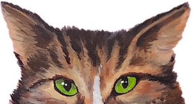
Illustration & hand lettering.
I use illustration and hand lettering to bring a more personal, crafted feel to both internal and external creative. Whether it's a custom icon set, a hand-drawn map, or a lettered headline, these elements help the work feel more human with the added bonus of feeling more memorable, too. :)
creative crew: bridgette dasilva, drew wildes, the martin agency
illustration


some illustration work I've done
hand lettering


my one true love, hand lettering <3

GEICO • Freelance
Wedding signage & fine art.
I design custom wedding signage and artwork for individuals or couples looking for something special, whether through Etsy or by word of mouth. Each project is tailored to the event’s style and tone, from playful welcome signs to elegant seating charts and table numbers. I handle both the design and print-ready prep, creating thoughtful, visually cohesive pieces that become part of the celebration (and often something people want to keep after).
creative crew:
Wedding Signage
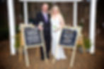
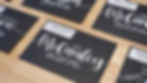

please come to me with more of this type of work!
fine art


